VitePress Cross-Framework Rendering Strategy
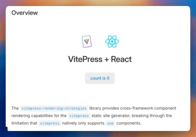
Overview
'/%3e%3cpath%20d='M6.85877%207.6188C6.71731%206.59948%207.41859%205.65703%208.42512%205.51378L33.9399%201.88237C34.9465%201.73911%2035.8771%202.4493%2036.0186%203.46861L41.1412%2040.3812C41.2827%2041.4005%2040.5814%2042.343%2039.5749%2042.4862L14.0601%2046.1176C13.0535%2046.2609%2012.1229%2045.5507%2011.9814%2044.5314L6.85877%207.6188Z'%20fill='white'/%3e%3cpath%20d='M33.1857%2014.9195L25.8505%2034.1576C25.6991%2034.5547%2025.1763%2034.63%2024.9177%2034.2919L12.3343%2017.8339C12.0526%2017.4655%2012.3217%2016.9339%2012.7806%2016.9524L22.9053%2017.3607C22.9698%2017.3633%2023.0344%2017.3541%2023.0956%2017.3337L32.5088%2014.1992C32.9431%2014.0546%2033.3503%2014.4878%2033.1857%2014.9195Z'%20fill='url(%23paint1_linear_1287_1214)'/%3e%3cpath%20d='M27.0251%2012.5756L19.9352%2015.0427C19.8187%2015.0832%2019.7444%2015.1986%2019.7546%2015.3231L20.3916%2023.063C20.4066%2023.2453%2020.5904%2023.3628%2020.7588%2023.2977L22.7226%2022.5392C22.9064%2022.4682%2023.1021%2022.6138%2023.0905%2022.8128L22.9102%2025.8903C22.8982%2026.0974%2023.1093%2026.2436%2023.295%2026.1567L24.4948%2025.5953C24.6808%2025.5084%2024.892%2025.6549%2024.8795%2025.8624L24.5855%2030.6979C24.5671%2031.0004%2024.9759%2031.1067%2025.1013%2030.8321L25.185%2030.6487L29.4298%2017.8014C29.5008%2017.5863%2029.2968%2017.3809%2029.0847%2017.454L27.0519%2018.1547C26.8609%2018.2205%2026.6675%2018.0586%2026.6954%2017.8561L27.3823%2012.8739C27.4103%2012.6712%2027.2163%2012.5091%2027.0251%2012.5756Z'%20fill='url(%23paint2_linear_1287_1214)'/%3e%3cdefs%3e%3clinearGradient%20id='paint0_linear_1287_1214'%20x1='6.48163'%20y1='1.9759'%20x2='39.05'%20y2='48.2064'%20gradientUnits='userSpaceOnUse'%3e%3cstop%20stop-color='%2349C7FF'/%3e%3cstop%20offset='1'%20stop-color='%23BD36FF'/%3e%3c/linearGradient%3e%3clinearGradient%20id='paint1_linear_1287_1214'%20x1='11.8848'%20y1='16.4266'%20x2='26.7246'%20y2='31.4177'%20gradientUnits='userSpaceOnUse'%3e%3cstop%20stop-color='%2341D1FF'/%3e%3cstop%20offset='1'%20stop-color='%23BD34FE'/%3e%3c/linearGradient%3e%3clinearGradient%20id='paint2_linear_1287_1214'%20x1='21.8138'%20y1='13.7046'%20x2='26.2464'%20y2='28.8069'%20gradientUnits='userSpaceOnUse'%3e%3cstop%20stop-color='%23FFEA83'/%3e%3cstop%20offset='0.0833333'%20stop-color='%23FFDD35'/%3e%3cstop%20offset='1'%20stop-color='%23FFA800'/%3e%3c/linearGradient%3e%3c/defs%3e%3c/svg%3e)

VitePress + React
The vitepress-rendering-strategies library provides cross-framework component rendering capabilities for the vitepress static site generator, breaking through the limitation that vitepress natively only supports vue components.
Currently only extends support for
reactcomponent rendering, with future support planned for other mainstreamUIframeworks (such assolid,svelte,preact,angular, etc.).
Technical Architecture Overview
This library is inspired by astro's Islands Architecture design, implementing cross-framework component integration on top of vitepress's SSG (Static Site Generation) foundation.
Core Architecture Features:
- Static-First: Based on
vitepress'sSSGarchitecture, components are pre-rendered at build time. - Selective
hydration: Only components that need interaction are activated on the client side. - Framework Isolation: Each framework component runs independently, with each component container completing
hydrationindependently, avoiding global state conflicts. - Progressive Enhancement: Prioritizes static content, gradually enhancing to interactive applications through different rendering strategies.
Feature Highlights
- Cross-Framework Support: Currently provides native support for
reactcomponent rendering invitepress, with future expansion to other mainstream frameworks. - Diverse Rendering Strategies: Referencing
astro's template directives. Client directives currently supportclient:only,client:load,client:visiblerendering modes, withssr:onlyas the default rendering mode. - SPA Routing Optimization:
spa:sync-render(abbreviated asspa:sr) directive optimizesSPAroute switching performance. - One-way Data Transfer: Supports passing
propsfromvueto thereactcontainer upon the component's initial render to initialize thereactcomponent. This is a one-time transfer, not a reactive binding. - Development Experience: Complete
HMRsupport providing smooth development experience. - Environment Consistency: Maintains consistent rendering strategies between development and production environments, avoiding rendering issues caused by environment inconsistencies.
- Support for
MPAMode: Fully compatible withvitepress'sMPAmode. Even inMPAmode,reactcomponent rendering andhydrationwork normally.
Design Intent of spa:sync-render Directive
vitepress is an SSG application that completes page pre-rendering work during the build phase, with controlled client-side routing. Initial page rendering completes client-side hydration (filtering static nodes) work. When routes change, vitepress loads the client-side scripts that the target route page depends on, completing partial client-side rendering work. This is the typical architecture of SSG applications.
By default, vitepress-rendering-strategies integrates all components on the target page that require pre-rendering (non-vue components) into a single script (ssr-inject-code.[ContentHash].js). When switching routes, this script is preloaded. After vue finishes rendering the main content, the pre-rendered output is injected into the corresponding rendering container nodes. If a component requires hydration, its client-side script is then loaded to complete the client-side hydration process. While this ensures consistent component rendering behavior during route switches, it introduces a very typical problem: in route switching scenarios, it fails to leverage the performance advantages of pre-rendering and causes a component rendering flicker issue.
The following demo environment is running with CPU: 20x slowdown and 0.75x playback speed:
From the video, we can observe that when the main area updates, the Layout shift score value is divided into two parts:
Layout shift scorevalue caused by text content offset:0.1486.Layout shift scorevalue caused by resource loading offset:0.0010.
The text content Layout shift score has already reached the needs improvement threshold (0.10 ~ 0.25) agreed upon by Chrome, which causes users to experience noticeable visual flicker when switching routes.
In
vitepressSPAroute switching scenarios, the content update forvueis synchronous, whereas the loading and rendering of pre-renderedHTMLand correspondingCSSfor non-vuecomponents (likereact) are asynchronous. This timing discrepancy leads to a visual flicker and negates the performance advantages of pre-rendering during the switch.
The SSG architecture strategy adopted by vitepress is reasonable, and we do not intend to adjust the overall architecture. The goal is to enhance the performance advantages of pre-rendering as much as possible on the existing architecture. For this purpose, we provide the spa:sync-render (abbreviated as spa:sr) directive, which integrates the pre-rendered output of all components using this directive on the target page into vue's client-side rendering script, following vue's client-side rendering work and synchronously completing the rendering work of pre-rendered output, so users will not see component flicker issues in special scenarios.
The video shows a scenario using the spa:sync-render directive. Compared to the above scenario without using the spa:sync-render directive, when the main area updates, the Layout shift score value only includes Layout shift score value caused by resource loading offset: 0.0013.
The spa:sync-render feature is definitely beneficial for CLS metrics, but it also comes with performance overhead, so it needs to be used after careful consideration.
Documentation-oriented projects themselves are not recommended to integrate a large number of high-load, highly interactive rendering components. Documentation-oriented projects are more concerned with the time it takes to deliver the main content to the user. We assume that such components are non-critical rendering components. We do not recommend enabling the
spa:sync-renderdirective for these components, as it increases the size of thevueclient-side rendering script and also requires loading additional scripts to complete the component's rendering, which may delay the delivery of the main content.
Note on Render-Blocking Critical Styles
When switching routes to a specific page, if the page contains components using the spa:sync-render directive, the rendering of the main content will be deferred until all css modules required by those components have been loaded. This can block the page from rendering, impacting the user experience.
From the video, we can see that before rendering the main content, it's necessary to complete the loading and parsing of all css modules for components using the spa:sync-render directive, which introduces some rendering blocking and impacts user experience.
However, this is the intended default behavior. Components using the spa:sync-render directive are considered critical rendering components by default, and their corresponding styles are also treated as critical styles. These must be loaded and parsed before the main content is rendered to prevent users from seeing a component rendering flicker (FOUC, Flash of Unstyled Content).
Client Bundle Size Increase Explanation
When vitepress initially renders a page (not route switching), it completes the application's hydration work through a simplified vue client script (.lean.js). Simplified means that vitepress filters out all static nodes during compilation to reduce the script size for initial hydration.
When routes switch, vitepress loads the client-side scripts that the target route page depends on, completing partial client-side rendering work. This is a complete client-side rendering, and client-side scripts must contain all information for rendering components.
The size increase mentioned above only applies to client-side scripts loaded during route switching, and does not affect the vue client script (.lean.js) size during initial page rendering (not route switching).
Now let's calculate specifically how much additional size (uncompressed) is added:
client-runtime.jsmodule script, approximately13 KBin size.Used to manage the loading of
cssmodules for components using thespa:sync-renderdirective. This module completes preloading during the initialization of each page.Page client module script, size depends on the number of components and component size.
- Pre-rendered output from all components using the
spa:sync-renderdirective generated by server pre-rendering. - Render-blocking
cssmodules.
- Pre-rendered output from all components using the
import { __CSS_LOADING_RUNTIME__ } from './chunks/client-runtime.41d9d1b5.js';
await __CSS_LOADING_RUNTIME__([
  '/assets/styles.css',
  '/assets/styles2.css',
  '/assets/styles3.css'
]);For the current example page, Landing, ReactComp2, and ReactComp3 all use the spa:sync-render directive:
The module script without using the spa:sync-render directive is approximately 207 KB, while with the spa:sync-render directive it's approximately 212 KB and requires additional dependency on the client-runtime.js module script (about 13 KB), requiring an additional 18 KB of client-side scripts to be loaded.
We provide this directive to meet the synchronous rendering needs of critical rendering components, but developers should be cautious about its impact on client bundle size.
The ssr:only directive implies that the component is purely static. We assume such components are critical rendering components, so their rendering priority is aligned with vue components by default to eliminate visual inconsistencies during route transitions.
The core of
spa:sris to make a trade-off between a smoother route transition experience and smaller client bundle size. Please carefully evaluate whether your component is a critical component that requires synchronous rendering.
Based on the considerations above, we have established the following default rules:
- Components using the
client:onlydirective do not support thespa:sync-renderdirective. - Components using
client:*directives (other thanclient:only) do not enable thespa:sync-renderdirective by default, unless thespa:sync-render(orspa:sr) directive is explicitly added. - All components using the
ssr:onlydirective (including components with no directive) have thespa:sync-render(orspa:sr) directive enabled by default, unless explicitly enabled withspa:sync-render:disable(orspa:sr:disable) directive.
SPA Sync-Render Feature Does Not Work in Development
The spa:sync-render (or spa:sr) feature does not take effect during the development phase. The fundamental technical reason for this limitation lies in the architectural design of VitePress during development: in the development environment, VitePress uses spa modules to dynamically render key local content. These spa module scripts are executed using dynamic evaluation, a mechanism that is not conducive to the rendering container, which relies on the Vue engine, for obtaining and passing complete initial props.
Why is the production environment not affected by this limitation?
There is a fundamental difference in the timing of parsing
spamodule scripts between the two environments. In the production environment, the design intentionally completes the pre-rendering of the page'sHTMLfirst, and only then parses the correspondingspamodule script. Under this timing arrangement, when thespamodule script begins to execute, the rendering container's initialpropshave already completed their evaluation process. Therefore, the rendering component corresponding to the rendering container can be safely pre-rendered.In contrast, the development environment cannot obtain the complete post-rendering context information. The
propsobtained solely through the dynamic evaluation of thespamodule script are often incomplete or inaccurate. Under these circumstances, it is not possible to safely pre-render the component for the rendering container in advance. The system can only safely render the corresponding component after the page has finished rendering and thepropsfor the rendering container have been obtained.Design Trade-offs and Solutions
The essential reason for this limitation comes from the architectural differences caused by VitePress adopting different rendering strategies in the development and production environments. To minimize environmental discrepancies while ensuring a good development experience, the current library uses intermediate-layer technology during the development phase to simulate the rendering behavior of the production environment as closely as possible. This aims to ensure that the rendering behavior in development remains consistent with the user-specified rendering strategy in production. This is a technical trade-off between development experience and environmental consistency: prioritizing a stable and smooth development experience while using technical means to simulate production environment behavior to the greatest extent possible.
Usage
<script setup>
  import VueComp1 from './rendering-strategy-comps/vue/VueComp1.vue';
  const page = {
    title: 'Rendering Strategy',
  };
  const vueUniqueId = 'vue-unique-id';
</script>

<script lang="react">
  import ReactComp1 from './rendering-strategy-comps/react/ReactComp1';
  import { ReactComp2 } from './rendering-strategy-comps/react/ReactComp2';
  import ReactComp3 from './rendering-strategy-comps/react/ReactComp3';
  import { ReactComp4 } from './rendering-strategy-comps/react/ReactComp4';
  import { ReactComp5 } from './rendering-strategy-comps/react/ReactComp5';
  import ReactVueSharedComp from './rendering-strategy-comps/react/ReactVueSharedComp';
  import { Landing } from './rendering-strategy-comps/react/Landing';
</script>Strategy Design
The vitepress-rendering-strategies cross-framework rendering strategy currently provides four core rendering modes for react components, with each mode optimized for specific application scenarios.
Client:Only
Feature Analysis:
Suitable for client-side components with strong dependencies on the host environment, such as components that depend on the browser host environment's
window,documentobjects or host environmentAPI.This mode is typically used for rendering non-critical or lightweight components, benefiting
TTFBmetrics (reducing server load), but not beneficial forFCP,LCPmetrics (no content on first screen),TTImetrics (need to wait for JS loading), andSEO(content not in initial HTML). The impact onINPmetrics depends on component complexity.This mode has low (or almost no) server load, with the entire rendering overhead borne entirely by the user's host environment. Providers can typically host scripts on
CDNor use it as a fallback solution during high server load.This mode has low mental burden for developers. It's commonly used when there's no need to integrate complex rendering logic in development environments and when partially updating components in production environments. It's currently the most common rendering mode.
<script lang="react">
  import ReactComp1 from './rendering-strategy-comps/react/ReactComp1';
</script>

<ReactComp1 client:only render-strategy="client:only" component-name="ReactComp1" :page-title="page.title" :render-count="1" />import { useState } from 'react';
import type { CompProps } from '../type';
import './css/rc1.css';
import { renderSharedLicense } from './shared/renderSharedLicense';
export default function ReactComp1(props: CompProps) {
const [count, setCount] = useState(0);
return (
<div className="react-comp1-demo">
<strong>
{props['render-count']}: Rendering Strategy:{' '}
{props['render-strategy']}
</strong>
<ol>
<li>
<strong>Component Name:</strong>{' '}
<span>{props['component-name']}</span>
</li>
<li>
<strong>Page Title:</strong> <span>{props['page-title']}</span>
</li>
<li>
<strong>License:</strong> <span>{renderSharedLicense()}</span>
</li>
<li>
<button
className="rc1-button"
onClick={() => setCount(count + 1)}
type="button"
>
Click Me!
</button>
<strong>Client-Only Rendering Mode, React Instance Count:</strong>{' '}
<span>{count}</span>
</li>
</ol>
</div>
);
}export const renderSharedLicense = () => {
return 'Released under the CC BY-SA 4.0 License. [SHARED MODULE FOR HMR TEST]';
};.rc1-button {
padding: 5px;
border-radius: 8px;
font-size: 14px;
margin-right: 8px;
background-color: #56a8ab;
color: #9ee2d3;
border: none;
}The container is pre-processed into:
<div
  __render_id__="5abc056a"
  __render_directive__="client:only"
  __render_component__="ReactComp1"
  __spa_sync_render__="false"
  render-strategy="client:only"
  component-name="ReactComp1"
  page-title="Rendering Strategy"
  render-count="1"
></div>Rendering result:
SSR:Only
Feature Analysis:
Suitable for pure static content components, such as data display,
SEOcritical content, and other components that don't require client-side interaction. Server rendering priority strategy is the most commonly used rendering strategy for document content-oriented (SSG). This is the default rendering strategy forvitepress-rendering-strategies.astroalso adopts this strategy as the default rendering strategy:Astro leverages server rendering over client-side rendering in the browser as much as possible.
Combined with
SSGmode, pre-rendering overhead only occurs during project build time. After build completion, the generated staticHTMLcan be hosted onCDNwithout affecting production server load. If specific real-time rendering support is needed, it can be combined withISRfor implementation. This mode can also serve as a fallback solution during high server load.Except for not being beneficial for real-time rendering and interactivity requirements, this mode is beneficial for all other metrics (
FCP,LCP,SEO, etc.) while avoiding increases in client-sideJavaScriptbundle size.
This is the default rendering strategy for
vitepress-rendering-strategies, aligning with the core needs of document-oriented projects.
<script lang="react">
  import { ReactComp2 } from './rendering-strategy-comps/react/ReactComp2';
</script>

<ReactComp2 ssr:only spa:sr render-strategy="ssr:only" component-name="ReactComp2" :page-title="page.title" :render-count="2" />import { readFileSync } from 'node:fs';
import { join } from 'pathe';
import { useState } from 'react';
import type { CompProps } from '../type';
import './css/rc2.css';
import { renderSharedLicense } from './shared/renderSharedLicense';
interface LocalData {
data: {
id: number;
name: string;
email: string;
}[];
}
const targetPath = join(import.meta.dirname, 'local-data.json');
export function ReactComp2(props: CompProps) {
const [count, setCount] = useState(0);
const data = JSON.parse(readFileSync(targetPath, 'utf-8')) as LocalData;
const displayLocalData = () => {
const showLocalList = data.data.map(item => (
<li key={item.id}>
<span>
<strong>ID:</strong> {item.id}
</span>
<br />
<span>
<strong>Name:</strong> {item.name}
</span>
<br />
<span>
<strong>Email:</strong> {item.email}
</span>
</li>
));
return <ul>{showLocalList}</ul>;
};
return (
<div className="react-comp2-demo">
<strong>
{props['render-count']}: Rendering Strategy:{' '}
{props['render-strategy']}
</strong>
<ol>
<li>
<strong>Component Name:</strong>{' '}
<span>{props['component-name']}</span>
</li>
<li>
<strong>Page Title:</strong> <span>{props['page-title']}</span>
</li>
<li>
<button
className="rc2-button"
onClick={() => setCount(count + 1)}
type="button"
>
Click Me!
</button>
<strong>Pre-rendering Mode Only, React Instance Count:</strong>{' '}
<span>{count}</span>
</li>
</ol>
<div>{displayLocalData()}</div>
<div>
<span>
<strong>License:</strong> {renderSharedLicense()}
</span>
</div>
</div>
);
}export const renderSharedLicense = () => {
return 'Released under the CC BY-SA 4.0 License. [SHARED MODULE FOR HMR TEST]';
};{
"data": [
{
"id": 1,
"name": "Senao Xi",
"email": "senaoxi@gmail.com"
},
{
"id": 2,
"name": "Doe",
"email": "doe@gmail.com"
},
{
"id": 3,
"name": "Jane Doe",
"email": "jane.doe@gmail.com"
}
]
}.rc2-button {
padding: 5px;
border-radius: 8px;
font-size: 14px;
margin-right: 8px;
background-color: pink;
color: orange;
border: none;
}The container is pre-processed into:
<div
  __render_id__="17fe40ca"
  __render_directive__="ssr:only"
  __render_component__="ReactComp2"
  __spa_sync_render__="true"
  render-strategy="ssr:only"
  component-name="ReactComp2"
  page-title="Rendering Strategy"
  render-count="2"
></div>Rendering result:
- Component Name: ReactComp2
- Page Title: Rendering Strategy
- Pre-rendering Mode Only, React Instance Count: 0
- ID: 1
Name: Senao Xi
Email: senaoxi@gmail.com - ID: 2
Name: Doe
Email: doe@gmail.com - ID: 3
Name: Jane Doe
Email: jane.doe@gmail.com
Client:Load
Feature Analysis:
- This is a typical isomorphic application component that requires server-side rendering to improve first-screen performance while needing client-side interaction functionality, suitable for critical component rendering.
- Adopts an architecture similar to traditional
SSR, pre-rendering components at build time to generate initialHTML, with client-side scripts executinghydrationwork immediately after loading to take over component interaction. TraditionalSSRapplications may encounter performance bottleneck issues, including server rendering performance issues during high concurrency and client-sideFID,INPmetric issues, giving users the feeling of a fake site with weak interactivity. Islands Architecture simplifies the complexity of traditionalSSRarchitecture, allowing each component container to independently complete rendering andhydrationprocesses without waiting for all components to finish rendering before performing one-time root containerhydration. - Note that this is different from traditional
SSRarchitecture - this completeshydrationwork on top ofSSGarchitecture. Pre-rendering is completed at build time, generating staticHTML, rather than runtime rendering in traditionalSSR. After build completion, it can be hosted onCDNwithout affecting production server load. Therefore, using this mode compared tossr:onlymode adds client-sidehydrationprocess, with this overhead borne byCDNand user host environment. - This mode typically benefits
FCP,LCPmetrics (quickly displaying content) but is not beneficial forTTImetrics (requireshydrationtime). The impact onFID,INPmetrics depends on the degree of main thread blocking duringhydrationand component complexity.
<script lang="react">
  import ReactComp3 from './rendering-strategy-comps/react/ReactComp3';
</script>

<ReactComp3 client:load spa:sync-render render-strategy="client:load" component-name="ReactComp3" :page-title="page.title" :render-count="3" />import { useState } from 'react';
import type { CompProps } from '../type';
import './css/rc3.css';
export default function ReactComp3(props: CompProps) {
const [count, setCount] = useState(0);
return (
<div className="react-comp3-demo">
<strong>
{props['render-count']}: Rendering Strategy:{' '}
{props['render-strategy']}
</strong>
<ol>
<li>
<strong>Component Name:</strong>{' '}
<span>{props['component-name']}</span>
</li>
<li>
<strong>Page Title:</strong> <span>{props['page-title']}</span>
</li>
<li>
<button
className="rc3-button"
onClick={() => setCount(count + 1)}
type="button"
>
Click Me!
</button>
<strong>
Pre-rendering Client Hydration Mode, React Instance Count:
</strong>{' '}
<span>{count}</span>
</li>
</ol>
</div>
);
}.rc3-button {
padding: 5px;
border-radius: 8px;
font-size: 14px;
margin-right: 8px;
background-color: #9ceaca63;
color: #1dd270;
border: none;
}The container is pre-processed into:
<div
  __render_id__="1194afdb"
  __render_directive__="client:load"
  __render_component__="ReactComp3"
  __spa_sync_render__="true"
  render-strategy="client:load"
  component-name="ReactComp3"
  page-title="Rendering Strategy"
  render-count="3"
></div>Rendering result:
- Component Name: ReactComp3
- Page Title: Rendering Strategy
- Pre-rendering Client Hydration Mode, React Instance Count: 0
Client:Visible
Feature Analysis:
- Suitable for interactive components that are not critical content on the first screen, such as comment systems at the bottom of pages, chart components, etc. However, note that component scripts will adopt preloading strategy by default, not pure lazy loading.
- Features can refer to
client:load.
<script lang="react">
  import { ReactComp4 } from './rendering-strategy-comps/react/ReactComp4';
</script>

<ReactComp4 client:visible render-strategy="client:visible" component-name="ReactComp4" :page-title="page.title" :render-count="4" />import { useState } from 'react';
import type { CompProps } from '../type';
export function ReactComp4(props: CompProps) {
const [count, setCount] = useState(0);
return (
<div className="react-comp4-demo">
<strong>
{props['render-count']}: Rendering Strategy:{' '}
{props['render-strategy']}
</strong>
<ol>
<li>
<strong>Component Name:</strong>{' '}
<span>{props['component-name']}</span>
</li>
<li>
<strong>Page Title:</strong> <span>{props['page-title']}</span>
</li>
<li>
<button
style={{
padding: '5px',
borderRadius: '8px',
fontSize: '14px',
marginRight: '8px',
backgroundColor: '#56a8ab',
color: '#9ee2d3',
border: 'none'
}}
onClick={() => setCount(count + 1)}
type="button"
>
Click Me!
</button>
<strong>
Pre-rendering Client Visible Hydration Mode, React Instance
Count:
</strong>{' '}
<span>{count}</span>
</li>
</ol>
</div>
);
}The container is pre-processed into:
<div
  __render_id__="473801e9"
  __render_directive__="client:visible"
  __render_component__="ReactComp4"
  __spa_sync_render__="false"
  render-strategy="client:visible"
  component-name="ReactComp4"
  page-title="Rendering Strategy"
  render-count="4"
></div>Rendering result:
- Component Name: ReactComp4
- Page Title: Rendering Strategy
- Pre-rendering Client Visible Hydration Mode, React Instance Count: 0
Default Strategy
The default rendering strategy is equivalent to ssr:only mode. For details, see ssr:only.
<script lang="react">
  import { ReactComp5 } from './rendering-strategy-comps/react/ReactComp5';
</script>

<ReactComp5 render-strategy="default" component-name="ReactComp5" :page-title="page.title" :render-count="5" />import { useState } from 'react';
import type { CompProps } from '../type';
export function ReactComp5(props: CompProps) {
const [count, setCount] = useState(0);
return (
<div className="react-comp5-demo">
<strong>
{props['render-count']}: Rendering Strategy:{' '}
{props['render-strategy']}
</strong>
<ol>
<li>
<strong>Component Name:</strong>{' '}
<span>{props['component-name']}</span>
</li>
<li>
<strong>Page Title:</strong> <span>{props['page-title']}</span>
</li>
<li>
<button
style={{
padding: '5px',
borderRadius: '8px',
fontSize: '14px',
marginRight: '8px',
backgroundColor: '#56a8ab',
color: '#9ee2d3',
border: 'none'
}}
onClick={() => setCount(count + 1)}
type="button"
>
Click Me!
</button>
<strong>
Default Rendering Mode (Pre-rendering Mode Only), React Instance
Count:
</strong>{' '}
<span>{count}</span>
</li>
</ol>
</div>
);
}The container is pre-processed into:
<div
  __render_id__="75efecde"
  __render_directive__="ssr:only"
  __render_component__="ReactComp5"
  __spa_sync_render__="true"
  render-strategy="default"
  component-name="ReactComp5"
  page-title="Rendering Strategy"
  render-count="5"
></div>Rendering result:
- Component Name: ReactComp5
- Page Title: Rendering Strategy
- Default Rendering Mode (Pre-rendering Mode Only), React Instance Count: 0
Rendering Strategy Combination
This library supports nested usage of vue components and react components. During component initial rendering, the vue parent component can one-time pass data as props to react child components through slot for initializing react component state.
The initial snapshot of the rendering root container is first processed by the
vuerendering engine, then completed by the correspondingUIframework's rendering work, so the rendering component'spropscan access the root container snapshot properties.
<script setup>
import VueComp1 from './rendering-strategy-comps/vue/VueComp1.vue';
const page = {
  title: 'Rendering Strategy'
};
const vueUniqueId = 'vue-unique-id';
</script>

<script lang="react">
import ReactVueSharedComp from './rendering-strategy-comps/react/ReactVueSharedComp';
</script>

<VueComp1
  :unique-id="vueUniqueId"
  render-strategy="client:only"
  component-name="VueComp1"
  :page-title="page.title"
  :render-count="6"
>
  <template #default="{ vueInfo }">
    <ReactVueSharedComp client:only render-strategy="client:only" component-name="ReactVueSharedComp" :page-title="page.title" render-count="3-7" :vue-info="vueInfo" />
  </template>
</VueComp1>import { useState } from 'react';
import type { CompProps } from '../type';
interface ReactVueSharedCompProps extends CompProps {
'vue-info': string;
}
export default function ReactVueSharedComp(props: ReactVueSharedCompProps) {
const [count, setCount] = useState(0);
return (
<div className="react-vue-shared-comp">
<strong>
{props['render-count']}: Rendering Strategy:{' '}
{props['render-strategy']}
</strong>
<ol>
<li>
<strong>Component Name:</strong>{' '}
<span>{props['component-name']}</span>
</li>
<li>
<strong>Page Title:</strong> <span>{props['page-title']}</span>
</li>
<li>
<strong>Vue Component Info:</strong>{' '}
<span>{props['vue-info']}</span>
</li>
<li>
<button
style={{
padding: '5px',
borderRadius: '8px',
fontSize: '14px',
marginRight: '8px',
backgroundColor: '#56a8ab',
color: '#9ee2d3',
border: 'none'
}}
onClick={() => setCount(count + 1)}
type="button"
>
Click Me!
</button>
<strong>Client-Only Rendering Mode, React Instance Count:</strong>{' '}
<span>{count}</span>
</li>
</ol>
</div>
);
}<script setup lang="ts">
export interface CompProps {
componentName: string;
renderStrategy: string;
pageTitle: string;
renderCount: number;
}
const props = defineProps<CompProps>();
const vueInfo = 'VueComp1';
</script>
<template>
<div class="vue-comp1-demo">
<strong>
{{ props.renderCount }}: Rendering Strategy:
{{ props.renderStrategy }}
</strong>
<ol>
<li>
<strong>Component Name:</strong>
<span>{{ props.componentName }}</span>
</li>
<li>
<strong>Page Title:</strong> <span>{{ props.pageTitle }}</span>
</li>
<li>
<strong>Child Component Rendering:</strong>
<slot :vue-info="vueInfo"></slot>
</li>
</ol>
</div>
</template>The container is pre-processed into:
<div
  __render_id__="354a7a63"
  __render_directive__="client:only"
  __render_component__="ReactVueSharedComp"
  __spa_sync_render__="false"
  render-strategy="client:only"
  component-name="ReactVueSharedComp"
  page-title="Rendering Strategy"
  render-count="3-7"
  vue-info="VueComp1"
></div>Rendering result:
- Component Name: VueComp1
- Page Title: Rendering Strategy
- Child Component Rendering:
Integration
To enable cross-framework rendering strategies in a vitepress project, you need to introduce the corresponding plugins in the build configuration:
import { defineConfig } from 'vitepress';
import vitepressReactRenderingStrategies from 'vitepress-rendering-strategies/react';

const vitePressConfig = defineConfig({
  // ...
});

vitepressReactRenderingStrategies(vitePressConfig);

export default vitePressConfig;import DefaultTheme from 'vitepress/theme';
import reactClientIntegration from 'vitepress-rendering-strategies/react/client';
import type { Theme } from 'vitepress';
const theme: Theme = {
extends: DefaultTheme,
async enhanceApp(context) {
await reactClientIntegration();
}
};
export default theme;Conventions
Component Naming Convention
- Must start with a capital letter (
PascalCasestyle): for example,MyComp. - The tag name must exactly match the name of the local import within the
<script lang="react">block in the same.mdfile. If you importimport { Landing as HomeLanding } from '...';, then the tag must be<HomeLanding ... />. - Any mismatch will cause the compilation to be skipped.
- Must start with a capital letter (
Only Self-Closing Tags are Supported
- Components used in
Markdownmust be written in a self-closing format:<Comp ... />. - Non-self-closing forms, like
<Comp>...</Comp>, will be skipped during compilation and a warning will be displayed.
- Components used in
Location and Imports
- Components must be imported within a
<script lang="react">block on the sameMarkdownpage. Unimported components will be ignored and skipped during compilation. - Components can be used within
Vueslots/templates (for example, inside<template #default>...</template>), and they will still be correctly discovered and transformed.
- Components must be imported within a
PropsPassing (Initialization)- All non-strategic attributes on the tag will be passed as
props(strings) to thereactcontainer.vuebindings like:page-title="page.title"are first evaluated byvueand written to theDOMattribute, then forwarded aspropsduringreactrendering/hydration. This can be considered as data passing for initializing the component's render and is not reactive. - Do not pass functions or event handlers (e.g.,
onClick) through attributes. Bridging callableprops/events across frameworks is not supported.
- All non-strategic attributes on the tag will be passed as
Components with
ssr:onlyDirective OnlyA component can adopt multiple rendering strategies on a single page. For example, a component can be rendered through a container with the
ssr:onlydirective, or through a container with theclient:onlydirective. It is important to note that when a component on a single page uses a non-ssr:onlyrendering strategy (e.g., using bothclient:onlyandssr:onlydirectives), the component cannot depend on Node.js environment APIs. However, if a component on a single page is rendered only through containers with thessr:onlydirective, it has the ability to depend on Node.js environment APIs. In other words, the component can use core Node.js modules likenode:fs.viteusually does not include modules with environment API dependencies as part of the dependency graph. Therefore, when a component uses environment APIs inssr:onlymode, you need to pay attention to the following two points:The path of the dependent module must be evaluated using the
import.meta.dirnamevariable.tsimport { readFileSync } from 'node:fs'; const targetPath = join(import.meta.dirname, 'local-data.json'); try { const data = JSON.parse(readFileSync(targetPath, 'utf-8')); } catch (error) { console.error(error); }Modules dependent on environment APIs do not support
HMRIn other words, the user needs to implement HMR support for changes to the
local-data.jsonmodule in the example above by themselves usingvite'shandleHotUpdatemechanism. Otherwise, they will need to manually refresh the page for the changes to take effect.tsimport { defineConfig } from 'vitepress'; const vitepressConfig = defineConfig({ vite: { plugins: [ { name: 'vite-plugin-environment-api-dependency-modules-hot-update', apply: 'serve', async handleHotUpdate(ctx) { const { file, server, modules } = ctx; if (file.includes('local-data.json')) { const updateModuleEntryPath = join( file, '../', 'ReactComp2.tsx' ); const updateModuleEntry = await server.moduleGraph.getModuleByUrl( updateModuleEntryPath ); if (updateModuleEntry) { server.moduleGraph.invalidateModule( updateModuleEntry, new Set(), Date.now(), true ); return [updateModuleEntry]; } } return modules; } } ] } }); export default vitepressConfig;At this point, the
HMRfeature will work correctly.
 XiSenao